 English
 العربية
 Deutsch
 Español
 Français
 Italiano
 Português
 Русский
 Türkçe
 Tiếng Việt
OKemall Image Resizer — The Complete Guide to Resizing Images Online
Free Online Image Resizer — Resize JPG, PNG, WebP Images to Exact Pixels
Introduction
You upload a photo straight from your phone to your website. It looks fine in your editor — maybe a little large, but it fits. What you do not see is that the image file is 4,000 pixels wide, weighs 6 MB, and takes 3.2 seconds to load on a mobile connection. Google's Core Web Vitals flag your page as "needs improvement." Your bounce rate climbs because visitors abandon the page before the image even finishes loading.
This is the single most common performance problem on the web, and the solution is not compression alone — it starts with resizing. Serving a 4,000-pixel-wide image to a 1,200-pixel-wide blog column is like using a billboard-sized canvas for a postage stamp. The browser has to download all 4,000 pixels, then shrink them down on the fly, wasting bandwidth and CPU cycles on the user's device.
The OKemall Image Resizer fixes this at the source. Upload any image — by drag and drop, file browser, or remote URL — and resize it to exact pixel dimensions using a visual slider, aspect ratio controls, flip and rotate tools, and format conversion all in one tool. The result: an image that is exactly the right size for its intended use, with a dramatically smaller file size and faster load time.
In this guide, we will explore the complete image optimization pipeline, exact pixel dimensions for every major platform, why the order of operations matters, and how to make image resizing an automatic part of your content workflow.
Why Resizing Matters More Than You Think
Most people think of image optimization as a file-size problem — "just compress it." But compression is the last step, not the first. Resizing comes first, and here is why it matters more:
1. Pixels cost bandwidth. Every pixel in an image is data that must travel over the network. A 4,000×3,000 pixel photo contains 12 million pixels. A 1,200×900 image contains 1.08 million pixels — roughly a 91% reduction. That reduction happens before any compression is applied, meaning compression works on a much smaller dataset and produces dramatically smaller files.
2. The browser still has to render all pixels. Even if CSS constrains an image to a 600-pixel-wide container, the browser downloads the full 4,000-pixel image, then scales it down on the fly. This consumes client-side CPU and memory, and on mobile devices, that cost is significant.
3. Responsive images need correctly sized sources. Modern web development uses the srcset attribute to serve different image sizes to different screen widths. But srcset only works if you have actually created those different sizes in the first place. Resizing produces the source files that make responsive images possible.
4. Platform-specific requirements are non-negotiable. An Instagram post must be 1,080×1,080 pixels for optimal quality. A YouTube thumbnail must be 1,280×720. A Shopify product image works best at 800×800. These are not suggestions — they are the specifications that determine whether your content looks sharp or blurry on each platform.
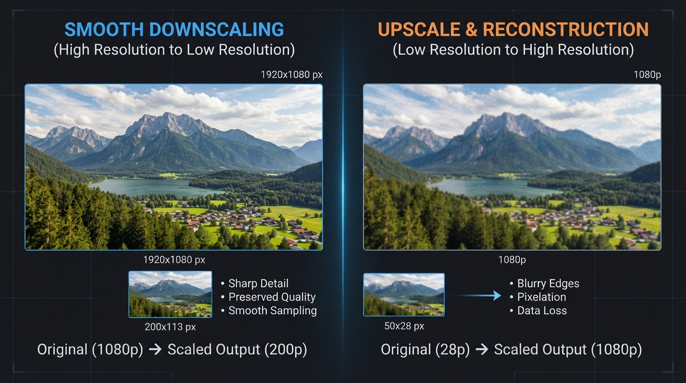
5. Resizing wrong (upscaling) destroys quality. Trying to make a 200-pixel-wide logo into a 2,000-pixel-wide hero image creates a blurry, pixelated, unusable result. Knowing when to resize down versus when you need a higher-resolution source image is critical — and the OKemall tool makes both directions clear.
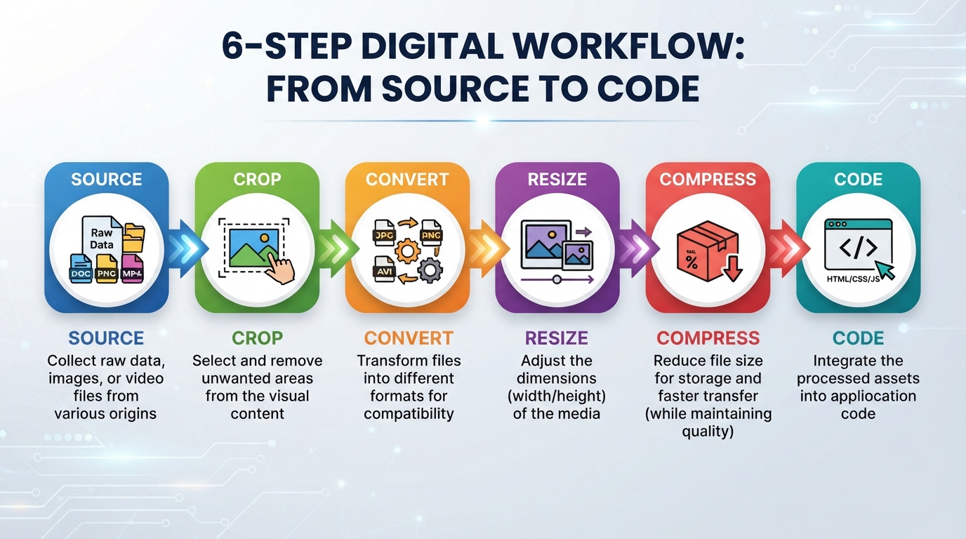
The Complete 6-Phase Image Optimization Pipeline
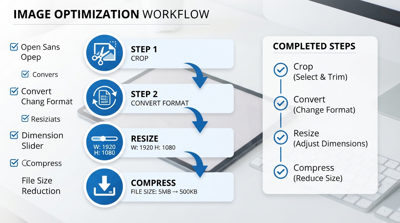
Resizing an image is one step in a larger workflow. At OKemall, the recommended pipeline has six phases, executed in this exact order for the best results:
Phase 1: Source Gathering — Start with the highest-quality base image available. If your source is a YouTube video, use the YouTube Thumbnail Downloader to get a clean 1,280×720 frame. If it is a stock photo, download the highest resolution available. You can always resize down — you can never add detail that is not there.
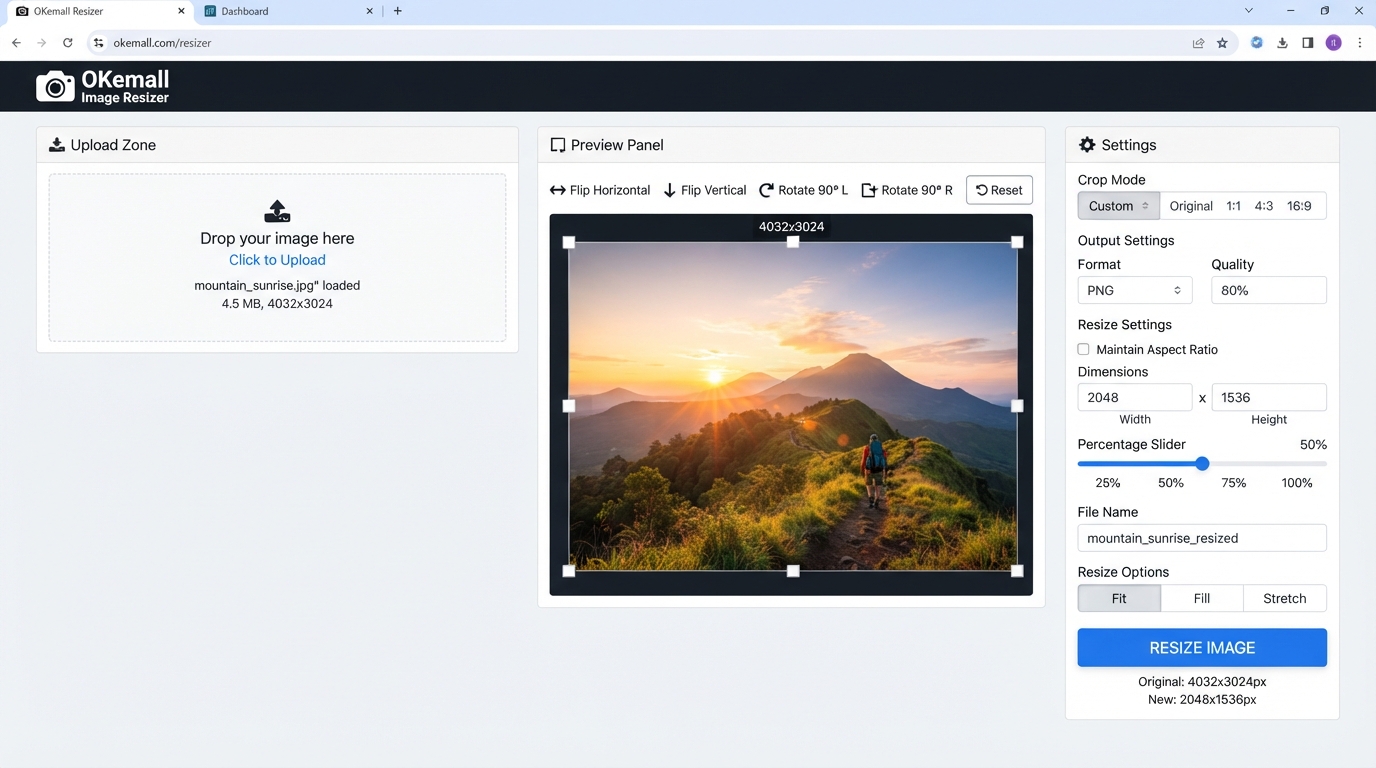
Phase 2: Cropping (BEFORE resizing) — Never resize an image that still has unwanted space around the edges. Use the Image Cropper first to cut out the exact subject, remove background clutter, and set the correct aspect ratio. The OKemall Image Resizer includes built-in crop controls — flip horizontally/vertically, rotate clockwise/counter-clockwise, and aspect ratio locking (16:9, 4:3, 1:1, 2:3, Freeform) — so you can handle cropping and resizing in one session.
Phase 3: Format Conversion (BEFORE resizing) — Convert your cropped image to a modern format before resizing. WebP maintains sharper edges and better detail when scaled down compared to JPG. Use the Image Converter or the built-in "Save As" dropdown in the resizer (JPG, PNG, GIF, BMP, WebP) to select the right output format.
Phase 4: Resizing (the core step) — Now, with a clean, correctly formatted image, resize to the exact pixel dimensions required by your target platform. The OKemall Image Resizer uses a visual percentage slider (100%–500%) plus direct pixel dimension inputs, so you can scale precisely. The tool shows both your starting size (e.g., 640×427) and the final size as you adjust.
Phase 5: Compression (AFTER resizing) — Take your perfectly sized image and run it through the Image Compressor. This extra-smart compression on an already-resized image produces tiny files — often 50–100 KB — with no visible quality loss. A resized but uncompressed image may still be unnecessarily large; compression is the final size reduction.
Phase 6: Code Deployment — If the final image is very small (under 10 KB), use Image to Base64 to embed it directly in your HTML or CSS, eliminating an HTTP request entirely. For normal-sized images, upload the file and use proper srcset attributes in your code.
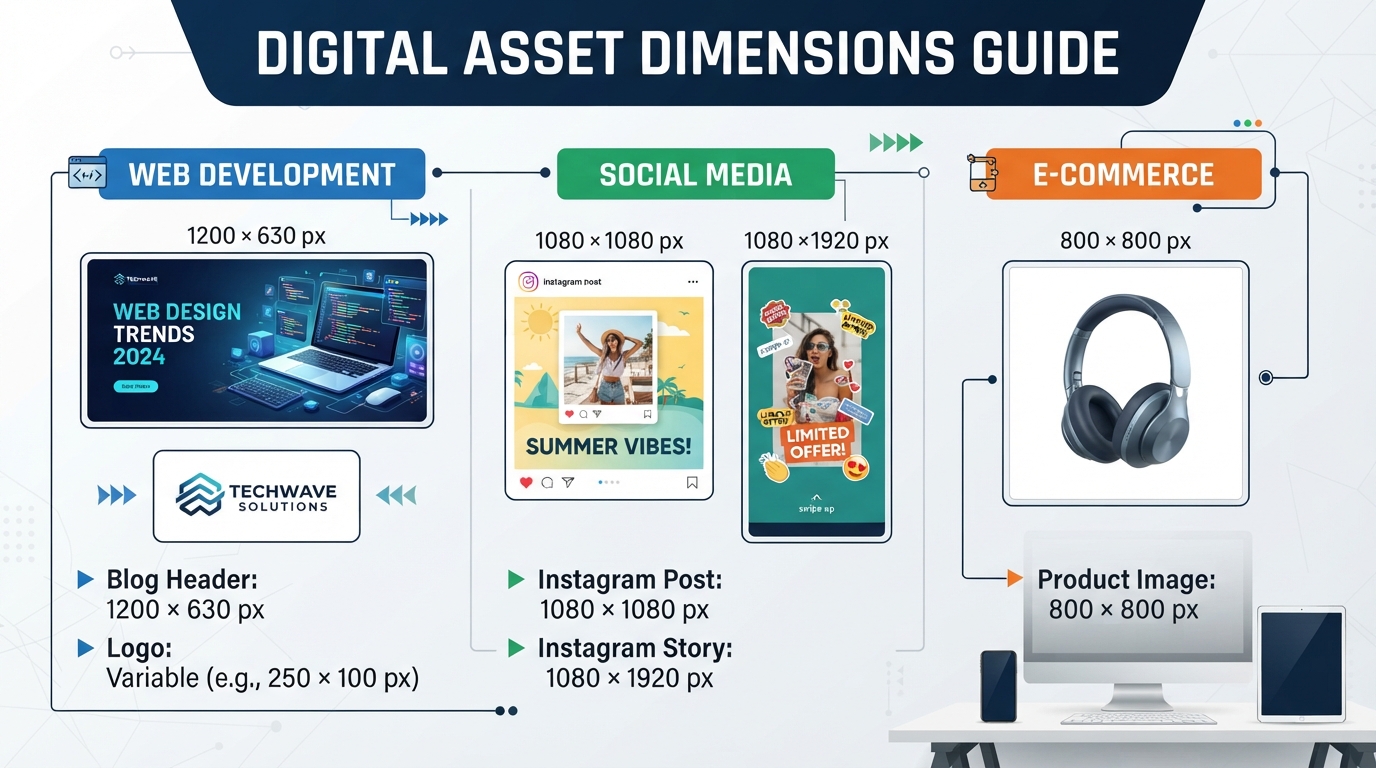
Real-World Pixel Dimensions for Every Platform
The OKemall Image Resizer documentation includes a comprehensive dimension cheatsheet. Here are the exact pixel sizes to target:
For Web Development:
- Full-width blog header: 1,200 × 630 px — Also the perfect size for Facebook and LinkedIn link previews.
- Website logo (in header): 200 × 50 px (or 250 × 100 px max).
- Sidebar widget image: 300 × 250 px — Standard ad/feature size.
For Social Media:
- Instagram post (square): 1,080 × 1,080 px.
- Instagram Story / TikTok / Reels: 1,080 × 1,920 px (9:16 aspect ratio).
- Facebook post: 1,200 × 630 px.
- Twitter/X header: 1,500 × 500 px.
- YouTube channel banner: 2,560 × 1,440 px (keep text in the safe center area of 1,546 × 423 px).
- YouTube video thumbnail: 1,280 × 720 px (16:9).
For E-Commerce (Shopify, WooCommerce):
- Main product image: 800 × 800 px (or 1,000 × 1,000 px to allow zooming).
- Product gallery thumbnails: 150 × 150 px.
For Email Newsletters:
- Header image: 600 px wide (height proportional to content).
- Most email clients cap display width around 600–640 px — resizing images wider than this wastes bandwidth with no visual benefit.
For Favicons:
- Standard favicon: 32 × 32 px or 16 × 16 px. Use the ICO Converter to generate the .ico file format after resizing.
How to Use the OKemall Image Resizer: Step-by-Step
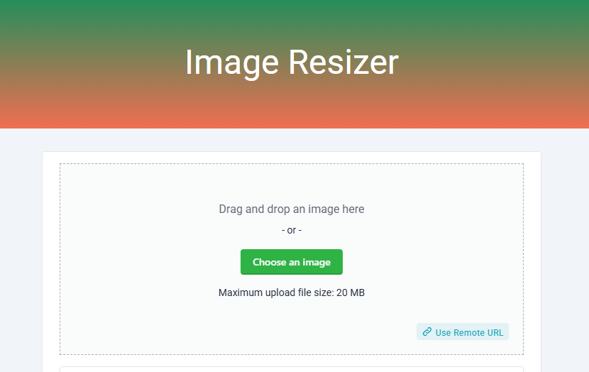
Step 1: Upload your image. Three options available:
- Drag and drop any image onto the upload zone.
- Click "Choose an image" to browse your device (maximum 20 MB).
- Click "Use Remote URL" to paste an image URL (with a clipboard paste button), then click Add.
Step 2 (optional): Adjust orientation and composition. Use the built-in controls before resizing:
- Flip Horizontally / Flip Vertically — Mirror the image.
- Clockwise / Counter Clockwise — Rotate 90° per click.
- Aspect ratio dropdown — Lock to 16:9, 4:3, 1:1, 2:3, or Freeform.
- Drag the crop overlay to frame your subject, and drag corner handles to adjust the crop area.
Step 3: Set the target size. Two methods available:
- Percentage slider (100%–500%): Slide to scale the image up or down. 100% = original size, <100% = smaller, >100% = larger. The slider uses noUiSlider for smooth, precise adjustments.
- Pixel dimensions: The tool displays both "Starting Size" (current dimensions) and "Final Size" (resized dimensions). Watch the final size update as you adjust.
Step 4: Choose the output format. Use the "Save As" dropdown to select JPG, PNG, GIF, BMP, or WebP. WebP is recommended for web use (25–34% smaller than JPG with equivalent quality). PNG is best for images requiring transparency.
Step 5: Click "Resize Image Now." The tool processes the resize and opens a preview modal showing the result. Verify the quality and dimensions.
Step 6: Download. In the preview modal, click "Download Image" to save the resized image to your device. Note: the preview shown in the modal is for reference — the actual downloaded file is the full processed image.
What Makes OKemall's Image Resizer Stand Out
Built-in crop, flip, and rotate controls. Unlike basic resizers that only change dimensions, the OKemall tool includes Cropper.js for cropping, rotation, mirroring, and aspect ratio locking — all in the same interface. You do not need to pre-process images in a separate tool.
Visual percentage slider. The noUiSlider gives you smooth, real-time feedback as you scale from 100% to 500%. Starting size and final size are displayed side by side, so you know exactly what the output dimensions will be.
Five output format options. Choose JPG, PNG, GIF, BMP, or WebP directly from the "Save As" dropdown. No need to resize, download, then convert in a separate tool — it is a combined resize-and-convert workflow.
Remote URL support. Resize images from publicly hosted URLs without downloading them first. Useful for stock photos, CDN-hosted assets, and social media images.
Client-side processing. Images are processed in your browser. They are never uploaded to or stored on OKemall servers, ensuring complete privacy.
No registration, no watermark. Open the page, resize your image, download. No signup, no branding, no restrictions.
Mobile-friendly and multi-language. Responsive design works on all devices. Available in 10 languages.
Important Limitations
Downscaling vs Upscaling. Resizing down (4,000px → 800px) produces crisp, detailed results. Resizing up (100px → 1,000px) produces blurry, pixelated results because the tool cannot create detail that does not exist in the source file. Always start with the highest resolution source available. If you need to enlarge a small image, use a dedicated AI upscaling tool — standard resizing is not designed for that.
Aspect ratio distortion. If you uncheck the aspect ratio lock and force a landscape image into a square, the image will stretch or squish. Always crop to the correct aspect ratio first, then resize. The built-in aspect ratio dropdown and crop overlay help you get the shape right before resizing.
DPI vs Pixels. Web images are measured in pixels (px). DPI (dots per inch) is a print concept. A 1,200×630 pixel image at 300 DPI looks identical on screen to the same image at 72 DPI. Do not worry about DPI when resizing images for the web — only pixels matter.
Pro Tips for Image Resizing
1. Always crop first, resize second. Removing unwanted space shrinks the pixel count before you even touch the size slider — making the final resized file even smaller.
2. Convert to WebP before resizing. WebP handles resizing artifacts better than JPG. The edges of text and graphics stay sharper when a WebP image is scaled down.
3. Resize before compressing. Compression algorithms work more efficiently on smaller pixel grids. A 50 KB resized image may compress to 30 KB, while the same compression on a full-size image may only bring it to 200 KB.
4. Use the percentage slider for proportional scaling. If you are resizing multiple images for the same purpose (all blog headers, all product thumbnails), the percentage slider gives you consistent relative sizing across all images.
5. Verify the final size before downloading. The "Final Size" display shows your target dimensions. Check that they match the platform requirements in the cheatsheet above before clicking Resize Image Now.
6. Pair with a responsive image strategy. Resizing creates the source files; srcset in your HTML serves the right one to each device. Together, they are the professional web development approach to image performance.
Beyond Resizing: The Full OKemall Image Toolkit
The Image Resizer is one piece of a complete image processing suite on OKemall:
- Image Cropper — Crop and frame before resizing.
- Image Converter — Convert between formats (especially to WebP).
- Image Compressor — Compress after resizing for the smallest possible file.
- Flip Image / Rotate Image — Fix orientation before final resizing.
- Image Enlarger — AI-assisted upscaling for situations where you need to go bigger.
- Image to Base64 — Embed tiny resized images directly in code.
- YouTube Thumbnail Downloader — Grab source images from videos.
- JPG to WebP — One-click conversion to the web-optimized format.
Frequently Asked Questions
Q: Is the OKemall Image Resizer free? Yes, completely free. No signup, no watermark, no usage limits.
Q: What is the maximum file size? 20 MB per image. For larger files, use the Image Compressor first to reduce the size, then resize.
Q: What image formats can I resize? The tool accepts all common web formats (JPG, PNG, WebP, GIF, BMP). Output can be saved as JPG, PNG, GIF, BMP, or WebP.
Q: Can I resize an image to be larger than the original? Yes — the percentage slider goes up to 500%. However, resizing up (upscaling) produces blurry, pixelated results because the tool cannot add detail that does not exist. For significant enlargement, use a dedicated AI upscaling tool.
Q: Does resizing reduce file size? Yes, significantly — especially when resizing down. A 4,000×3,000 pixel JPG (4 MB) resized to 1,200×900 pixels (200 KB) is approximately a 95% reduction in file size before any compression is applied.
Q: How do I resize for Instagram? Set the aspect ratio to 1:1 (Square), then resize to 1,080×1,080 pixels. For Stories or Reels, resize to 1,080×1,920 pixels.
Q: Are my images uploaded to a server? No. Processing happens client-side in your browser. Your images are never uploaded to or stored on OKemall servers.
Q: Does the tool work on mobile? Yes, the interface is fully responsive.
The single most impactful thing you can do for website performance — and for the visual quality of your content on social media — is resize your images to the exact dimensions they need to be. Not approximate. Not "close enough." Exact. A 1,200×630 blog header, a 1,080×1,080 Instagram post, an 800×800 product photo, a 600-pixel-wide email newsletter image — each one has a specific target, and delivering the right size means faster load times, sharper visuals, and a better experience for every user.
The OKemall Image Resizer makes this precision trivial. Built-in crop, flip, and rotate controls let you frame your image first. A percentage slider and pixel dimension display let you size it exactly. Format selection lets you choose the right output type. All of it happens in your browser — private, instant, and free.
Combine it with the Cropper, Converter, and Compressor, and you have a complete browser-based image optimization toolkit. Follow the pipeline — crop, convert, resize, compress — and every image you publish will be exactly the right size, with exactly the right file size, for exactly the right performance.
Make your images the right size before you upload them. Try the OKemall Image Resizer now — the backbone of web image optimization, free and ready when you are.


