Visual QR Code Generator: Boost Scans with Dynamic Design
Let’s be brutally honest for a second. When was the last time you were genuinely excited to scan a QR code?
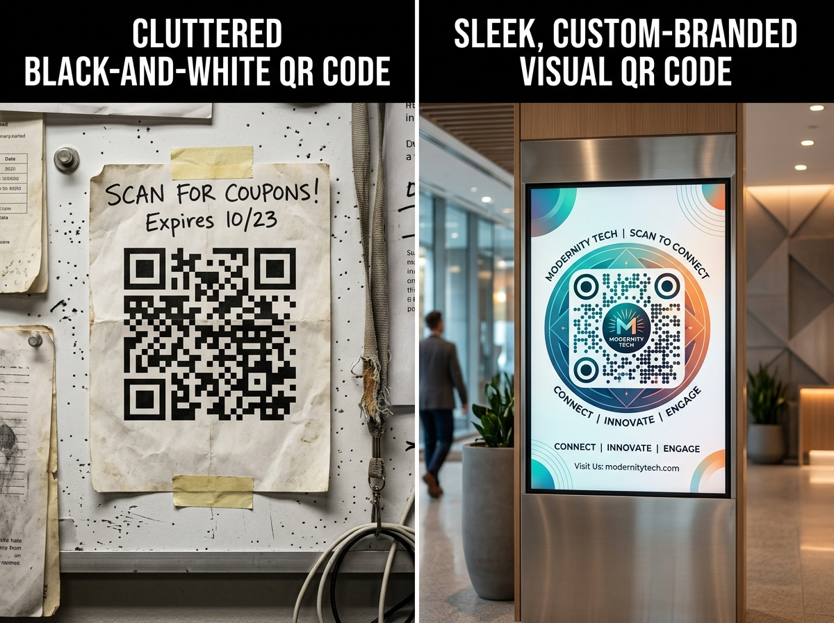
If you’re like most people, the answer is probably “never.” We’ve been conditioned to see those stark, black-and-white, pixelated mazes as a necessary evil a utilitarian bridge between the physical and digital worlds. They look like a glitch on an otherwise beautifully designed menu, a random sticker slapped on a window, or an afterthought on a million-dollar marketing campaign.
This visual pollution isn't just an aesthetic problem; it’s a conversion killer. In a digital landscape where user experience (UX) dictates purchasing decisions, relying on a standard, soulless QR code is like showing up to a black-tie event in sweatpants. It signals that you don’t care about the details.
But what if a QR code could be beautiful? What if it could be the centerpiece of your branding, sparking curiosity instead of passive indifference?
That’s exactly the problem a modern QR Code Generator solves. We aren’t just talking about adding a logo in the middle anymore; we’re talking about fully dynamic, visually harmonious data bridges that people actually want to scan. Let’s dissect the science and strategy behind creating QR codes that demand attention and drive action.
The Psychology of the "Black and White Blob": Why We’ve Been Doing It Wrong
Before we dive into the solution, we need to understand the deep-seated user friction associated with traditional QR codes. UX copywriting teaches us that every element on a page (or a table tent, or a billboard) sends a micro-signal. A standard QR code sends a bad one: "This is complex. This is technical. This might not work."
The Trust Deficit
Scammers love generic QR codes. They can print a malicious sticker and slap it over a legitimate one in a restaurant or parking meter. When users see a purely black-and-white, unbranded code, their subconscious risk assessment fires up. A branded, visually distinct code, however, carries the psychological markers of safety. It looks "owned" and intentional, reducing friction and increasing scan confidence.
The "Scanability" Myth
Many marketers cling to the high-contrast, ugly design because they fear straying from the standard will break the code. While contrast is technically essential, modern error correction levels (we’ll get to those later) allow for massive customization. You can remove up to 30% of the code's data modules and replace them with design elements without affecting scanability. The "safety" of the ugly blob is a myth that’s costing you scans.
Anatomy of a High-Performing Visual QR Code
Using a sophisticated QR Code Generator, you move from static necessity to dynamic asset. Here is the breakdown of the critical components you can control to transform your user’s experience.
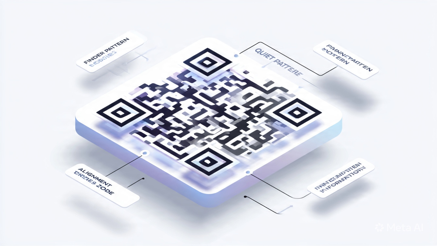
1. The Eyes (Position Detection Patterns)
Those three big squares in the corners? They don’t have to be solid black boxes. Advanced generators allow you to round the corners, hollow out the centers, or color them to match your brand palette. Changing the "eyes" is the quickest way to make a code look modern. A candy brand might use floating, colorful dots, while a law firm might use solid, serif-style squares.
2. The Body (Data Modules)
Instead of rigid squares, the granular data dots can be transformed into circular points (a "dot matrix" style). This single change instantly removes the "industrial barcode" vibe and replaces it with a tech-forward, organic feel. It reduces visual noise and blends seamlessly into lifestyle photography.
3. The Brand Core (The Logo)
Don’t just slap a logo on top without a clean kill zone (the white space around it). A smart visual QR code generator will automatically scale your logo to ensure it doesn’t disrupt the vital data modules behind it. This requires high error correction, which is non-negotiable for visual design.
4. The Call-to-Action (CTA Frame)
Your QR code shouldn’t float in a vacuum. Framing it with a contextual CTA—"Scan for Whiskey Tasting Notes"—changes the user’s internal question from "What is this thing?" to "What will I discover?" The frame integrates the code into the UI of your printed material.
Static vs. Dynamic: The Technical Tipping Point (A Step-by-Step Guide)
.png)
You cannot truly master visual QR codes without understanding the backend. This is where the real power of a dedicated online tool comes into play. When you visit a robust platform, you’re faced with a choice that dictates your entire marketing agility.
Step 1: Choosing the Right Mode (Static vs. Dynamic)
| Feature | Static QR Code | Dynamic QR Code |
|---|---|---|
| Data Storage | Data is hard-coded into the grid. | A short URL is stored, redirecting to data. |
| Editability | Dead. If you need to change the URL, you reprint. | Fully editable. Change the destination URL anytime. |
| Scan Analytics | None. You’re flying blind. | Tracks scans by time, location, and device. |
| Design Complexity | Simple is better (less data density). | Short URLs allow for dense, artistic customization. |
| Speed | Marginally faster recognition. | Negligible difference for modern smartphone cameras. |
The Expert’s Take: For marketing materials, never use Static. The ability to update a link is critical. Imagine printing 10,000 menus and the website goes down. With a dynamic code, you log into your QR Code Generator dashboard and redirect the code to a PDF backup menu in seconds. That saves you thousands of dollars.
Step 2: Uploading Your Brand Assets
Use a generator that automatically strips backgrounds and optimizes your logo size. Don’t use a low-res JPEG grabbed from your website footer. Use a sharp, transparent PNG. The tool should analyze the "clash" between your logo’s shape and the code’s vital zones.
Step 3: The Color Trap (Contrast Ratio)
Here is the biggest mistake users make: using low-contrast "aesthetic" pastels. Remember, the scanner reads the code exactly like a computer program reads binary. There must be a sharp distinction between the dark modules (foreground) and the light modules (background).
The Golden Rule: Your foreground color must be significantly darker than the background. A light grey on white will fail. A dark navy blue on a soft cream background, however, is a home run. Always test a gradient—if the "dark" part of your gradient falls below the contrast threshold, the code will fail on that edge.
Step 4: Error Correction – The "Design Budget"
QR codes use the Reed-Solomon error correction algorithm. This is your "design budget."
-
Low (L) - 7% recovery: Maximum data, minimal design. Avoid.
-
Medium (M) - 15% recovery: The standard sweet spot.
-
Quartile (Q) - 25% recovery: Good for logos.
-
High (H) - 30% recovery: The Visual Artist’s Choice. This allows you to heavily customize the eyes, embed a large logo, and morph the data dots. Always select High (H) when making a visual QR code. It sacrifices a tiny bit of data capacity (which you don't need with a short URL) for maximum design flexibility.
Real-World Use Cases: Where Visual Codes Dominate
A generic code takes people out of the experience. A visual code adds to it. Let’s look at specific verticals.
1. The Hospitality Industry (Menus & Wallets)
A static, ugly QR code on a fine-dining table screams "2020 pandemic pivot." A visual QR code engraved on a wooden block, colored to match the oak tables, with a round, wine-red logo, screams "modern hospitality."
-
UX Copy Tip: Don’t use the word "Menu." Use "Our Wine Story" or "The Chef's Inspiration." A QR Code Generator allows you to update this link daily to reflect the chef’s specials without re-engraving the wood.
2. Retail Packaging (The Unboxing Experience)
Apple doesn’t have QR codes on their boxes; they have beautifully symmetric design elements that happen to be scannable. You can mimic this. A cosmetics brand can transform the code into a floral mandala pattern leading to a "how to apply" video. It becomes a piece of the packaging art, not a blemish on it.
3. Event Networking (Digital Business Cards)
Paper business cards get lost. Digital business cards are memorable if the delivery mechanism is cool. Imagine a QR code shaped like your company’s logo, where the data modules seamlessly morph into the logo’s shape. This isn’t just a vCard transfer; it’s a conversation starter. It silently communicates that you work in innovation.
The "Art of Invisible" UI: Optimizing the Code Frame
When you generate that perfect visual code, you’re not done. The download format matters immensely.
Vector is Non-Negotiable:
If the tool you’re using doesn’t export in SVG, EPS, or PDF vector formats, walk away. Raster images (PNG, JPG) pixelate when scaled up for a billboard or large window decal.
The Quiet Zone:
This is the white border around the QR code. When you style a visual QR code, don’t let your background graphics bleed into this zone. The scanner uses this to distinguish the code from the surrounding environment. A standard safe zone is four modules wide.
Testing Across Devices:
The harsh reality is that not all camera apps are equal. An iPhone’s native camera is incredibly forgiving. An older Android device with a different scanning library might struggle if your contrast is too low.
-
The 3-Device Test: Scan with an iPhone, a flagship Android, and a budget Android device. If all three snap instantly, you’ve nailed the design.
Why Your Current Tool Might Be Failing You
Many free, cookie-cutter QR generators create "dead" codes. They lack the backend infrastructure to support dynamic redirects. They push you toward clunky, ad-infested interfaces. A premium, dedicated QR Code Generator platform ensures three things:
-
99.9% Uptime Redirects: If the server hosting your dynamic short URL goes down, your printed materials become useless. You need enterprise-grade reliability.
-
Bulk Design Consistency: If you’re generating 500 unique codes for a product drop, you need a batch feature that applies your visual style guide (logo, colors, eye shape) to all 500 instantly. Manual design is unsustainable.
-
Deep Analytics: A visual code is a conversion tool. You need to know if the design change actually improved the click-through rate (CTR) compared to your old black-and-white code. A proper tool provides the time-stamped scan data to prove the ROI of your redesign.
Conclusion: Stop Interrupting Your Aesthetic
A QR code is the front door to your digital world. You wouldn't leave your physical front door unpainted, splintered, and covered in ugly security stickers. So why do that to your digital entry points?
The bridge between the physical and the digital should be invisible. It shouldn’t feel like a transaction; it should feel like a continuation of the story you’re telling. By transforming your functional barcodes into design-driven, dynamic assets, you remove the subconscious "scam alert" and replace it with a "discovery magnet."
The technology has evolved. Static, ugly, unreadable blocks are a liability. The visual future is editable, trackable, and beautiful.
Ready to Build a Bridge People Actually Want to Cross?
You have the blueprint. You know the psychology, the error correction ratios, and the color contrast rules. Now it’s time to execute. Don’t just stick a code on your collateral; integrate it. Craft a visual asset that respects your brand guidelines and respects your user’s eye.
Design the first QR code your customers will actually remember. Start customizing your own high-converting, dynamic design today with this professional QR Code Generator and turn your daily scans into brand touchpoints.